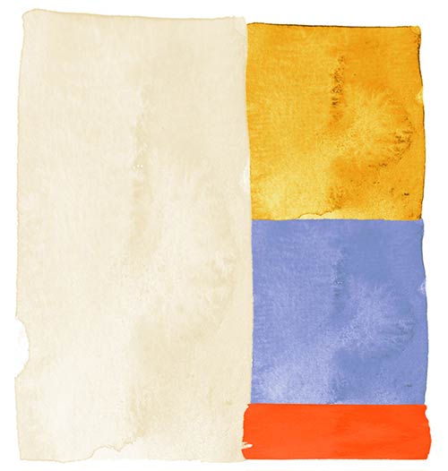
The 60-30-10 Rule: A Foolproof Method for Choosing Colour with Effortless Elegance
- Emerence de Potesta
- Mar 19
- 4 min read
Updated: Apr 7
I have been creating art for as long as I can remember, with colour assembly becoming second nature over time. When I started working in the wedding industry 10 years ago, one of the most common compliments I would receive was my use of colour, and how they "just worked" together so beautifully. I never tried to understand the science behind it—it just happened automatically for me.
Sometimes all it takes is taking a step back; and that’s when I realised that I had actually been applying several rules to my colour palettes intuitively.
Colours are so powerful. They have the ability to change one's mood, tell your story to the world, and create connection. It’s time to start honing in on that power—and having fun with it! In this guide, we’ll break down a simple approach to colour selection—one that works across weddings, interiors, and fashion—so you can confidently create beautiful palettes that feel effortless and refined.

1. The 60-30-10 Rule: A Foolproof System for Balance
One of the easiest ways to create a balanced colour scheme is to follow the 60-30-10 rule:
60% Neutral Base: Soft, desaturated, or pale colours that create a foundation (e.g., whites, beiges, muted pastels, or earthy tones).
30% supporting colours: A secondary set of colours that add depth without overpowering (e.g., dusty blues, terracottas, sage greens).
10% Accents: The pop of contrast that makes everything come to life (e.g., gold, deep emerald, bold fuchsia, or a statement print).
The same principle can be applied to:
Weddings: Table linens (70%), florals (20%), stationery accents (10%)
Interiors: Wall colour (70%), furniture (20%), decorative pieces (10%)
Fashion: Main wardrobe pieces (70%), layering elements (20%), accessories (10%)

2. Understanding Colour Harmony
Now that you have a framework, the next step is understanding why certain colours look good together.
Some key principles:
Complementary Colours: opposites on the colour wheel, like blue & orange, create contrast and energy.
Analogous Colours: next to each other, like pink, peach, and coral, create a soft, harmonious effect.
Monochromatic Schemes: feel sophisticated and refined, by combining similar colours of different shades and tints.
To desaturate any colour, simply add: white, black, grey, it's complimentary colour, or a combination of all! Combining saturated and desaturated colours will create interest and contrast for your palette.

Exercise: when you feel drawn to a particular image, fabric, or painting, study the balance of colours in it. What makes it feel cohesive? Is it contrast? Soft blending? A single bold pop?
3. How to Identify Neutrals, Supporting Colours & Accents
Before building your colour palette, it's essential to understand how to categorise colours effectively.
Here’s how to differentiate them:
Neutrals (60%): These are soft, light, or earthy tones that provide a foundation. Think whites, beiges, greys, and subtle pastels. A simple test: if the colour feels calming and recedes into the background, it’s likely a neutral.

Supporting Colour (30%): These are colours with lower intensity, meaning they are softened versions of pure hues. Think dusty rose, muted sage, or terracotta. A good test: compare it to a more vibrant version of the same colour—if it feels subdued and natural, it’s desaturated.

Accents (10%): These are the boldest colours in your palette. They are often pure hues or have high contrast. Think rich emerald, deep sapphire, or a striking coral. If a colour immediately draws the eye or feels energising, it’s likely an accent.

Exercise: take an image or an object and break down its colours into these categories. You’ll start to notice patterns in what you’re drawn to!
4. Finding Your Inspiration
One of the best ways to develop your colour style is to start with something you love.
This could be:
A Mood board: Gather images you’re naturally drawn to, then break down the colours to find commonalities. Pinterest is a great starting place.
An object you love: Could be a favourite painting, a fabric swatch, or a ceramic plate! Anything can serve as inspiration.
A place you love: A city, a landscape, or an old-world market might provide the perfect palette.
From there, explored complementary hues, play with contrast, and find ways to create a colour palette that speaks to you.
5. Applying Your Palette with Intention
Once you’ve identified your palette, the key is thoughtful application. Here’s how to bring it to life:
For Weddings:
Start with a neutral foundation (e.g., table linens, venue backdrop)
Layer in supporting hues through bridesmaids’ dresses, florals, or candles
Use accents sparingly in details like menus, napkins, or statement décor
For Interiors:
Walls & large furniture should be in your 60% base colour range
Accent chairs, rugs, and textiles bring in your 30%
Statement pieces like artwork, lamps, or cushions add that final 10%
For Fashion:
Wardrobe staples (pants, coats, classic dresses) should be your 60%
Layering pieces (knitwear, blouses, scarves) add depth (30%)
Shoes, jewellery, or statement bags serve as the 10% accent
By using this structured yet flexible approach, you can refine your aesthetic, ensure balance, and develop a personal colour language that feels distinctly yours.
Here are some examples of colour palettes, which can be applied to just about anything!
Whether you’re selecting colours for a wedding, styling your wardrobe, or curating your home, the key is intentionality. By using the 60-30-10 rule, understanding colour harmony, and drawing inspiration from what naturally speaks to you, you’ll create palettes that feel timeless and effortlessly beautiful. So next time you find yourself drawn to an image, an object, or a place, take a closer look. The perfect colour palette might already be waiting for you.
To discover more art by Emérence de Potesta applying these principles, whether it be for your home or wedding stationery, make sure to check out potestadesigns.com!


Comments